
Two of the four areas in DDI Manager are not about changing anything. They are about being able to answer one question: how many numbers are we using, and how has that developed?
It is rarely a question you ask yourself. It usually comes from outside — from an invoice that does not add up, from a budget being drawn, or from a contract negotiation with the carrier.
DDI Utilization — the highest consumption in a period
DDI Utilization shows the highest number of numbers in simultaneous use during a chosen period, and when that peak occurred.
That is an important distinction: it is not how many numbers you have, nor how many are in use right now. It is the peak — and the peak is typically what you are billed on.
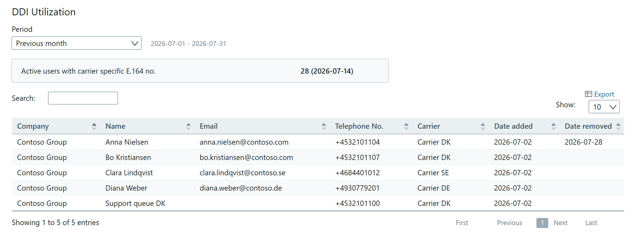
Choose the period at the top: Previous month, Current month or Custom date. The chosen period is shown as a date range below.
The summary shows a single line: Active users with carrier specific E.164 no. with the count and the date of the peak in brackets.
The detail table lists every number with:
- Company — What it shows: The customer the number belongs to
- Name — What it shows: The user or object the number is assigned to
- Email — What it shows: The user's address, if there is one
- Telephone No. — What it shows: The number itself
- Carrier — What it shows: Who the number comes from
- Date added — What it shows: When the number was assigned
- Date removed — What it shows: When it was released again — empty if it is still in use
Note that not every row has an email address. Numbers on call queues, auto attendants and other resource accounts appear with a name but no user.
Use Export if the figures need to go into a spreadsheet or be attached to an invoicing conversation.
DDI History — development over time
Where DDI Utilization looks at one period, DDI History shows the development across several months.
Choose the length under Period back in time (months): Current month, 2, 3, 6, 9, 12, 18, 24 or All.
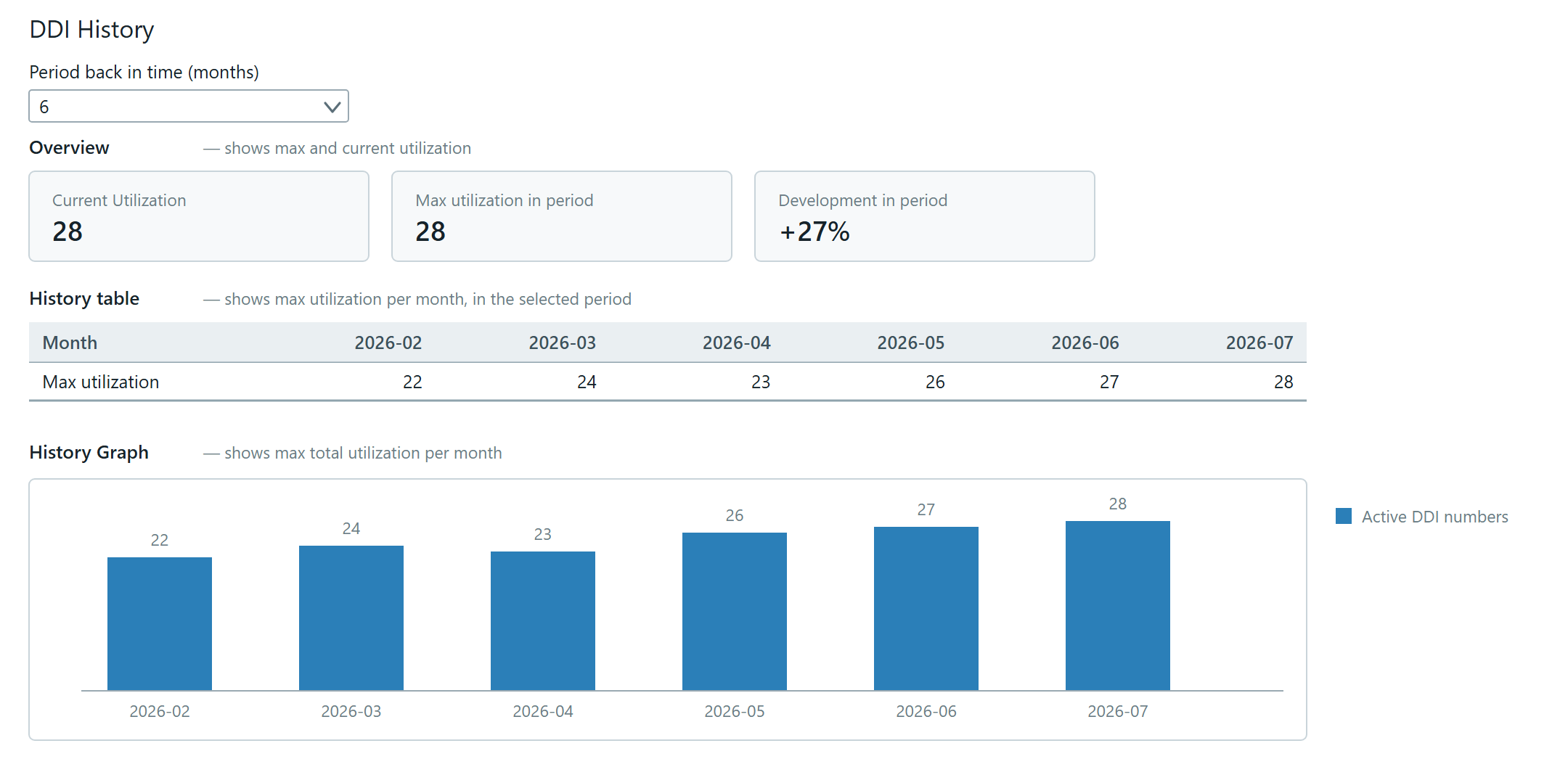
The page holds three views of the same data:
Overview — three figures side by side:
- Current Utilization — how many numbers are in use now
- Max utilization in period — the highest value in the chosen period
- Development in period — the difference as a percentage. It can be negative if consumption has fallen
History table — one column per month with that month's maximum.
History Graph — the same monthly figures as bars, so the direction is visible at a glance.
How to use the two screens
Checking an invoice. If the bill does not match your expectation, find the period in DDI Utilization, read the peak, and look at the date. An unexpected peak is often a handful of numbers that sat active for a few days during a migration.
Negotiating a contract. The history across 12 or 24 months shows whether consumption is stable, rising or falling. That is a better basis than the current figure alone.
Cleaning up. If Development in period is positive without the organisation having grown, there are probably numbers that were never released when people left. See Assign a number to a user for how a number is released again.