
The problem Statistics solves
Microsoft Teams Phone gives you calling. What it does not readily give you is an account of what happened to the calls. When someone asks why a customer waited eleven minutes, or whether the support line is actually staffed at eight in the morning, or whether the new routing change helped, the honest answer in most organisations is a shrug followed by a week of exporting things.
Statistics is the reporting layer in VoiceQ365 that closes that gap. It reads your tenant's call data — Direct Routing, Operator Connect, auto attendants, call queues and Microsoft's own call quality telemetry — and turns it into four dashboards you can read without a PowerShell session.
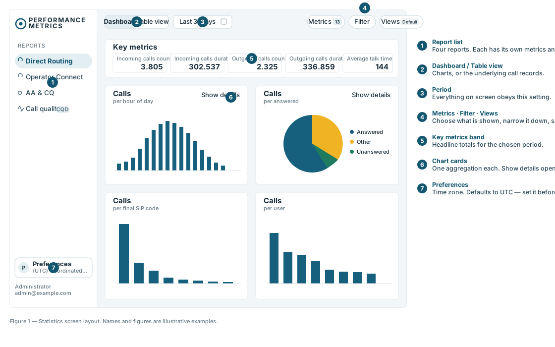
Four reports, four questions
| Report | The question it answers | Who reads it |
|---|---|---|
| Direct Routing | How much traffic is crossing our SBC trunks, and is it succeeding? | Telephony and network owners |
| Operator Connect | The same, for numbers delivered through an operator rather than our own trunks. | Telephony owners, operator management |
| AA & CQ | What happened to the people who called our queues and menus? | Team leaders, service owners, you |
| Call quality | Did the calls we did handle actually sound acceptable? | IT support, network owners |
If you only ever open one, open AA & CQ. The other three describe plumbing. That one describes customer experience.
The three numbers worth taking to a management meeting
1. Call result outcome
One chart splits every queue call into answered, abandoned, missed, failed and other. It is the closest thing you have to a service-level statement, and it takes about four seconds to read.
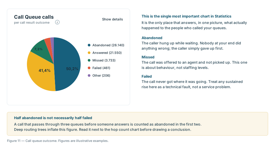
Why it matters to you: it converts "customers say they wait too long" into a figure you can put in front of a board, track month to month, and hold someone accountable for.
2. Agent opt-in ratio
Of the agents assigned to a queue, how many are actually signed in and able to take calls? A queue with twelve assigned agents and a 44% opt-in ratio is really a queue with five.
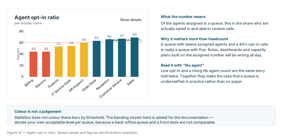
Why it matters to you: this is the metric that most often changes a decision, because it reframes a service complaint as a staffing or process question — with evidence rather than anecdote. Every rota and capacity plan built on the assigned headcount is wrong by the size of this gap.
3. Hop count
How many times a call is handed on before it is resolved. Ten hops is ten rounds of menus and hold music. Nobody designs that deliberately; it accumulates one reasonable change at a time over several years, and it is invisible until something counts it.
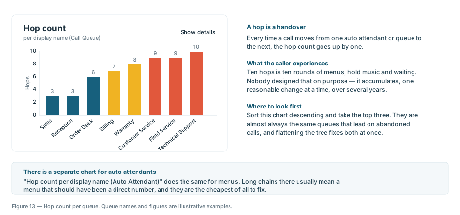
Why it matters to you: it is the cheapest improvement available. Flattening a routing tree costs configuration time, not licences or headcount, and it usually improves the abandoned figure at the same time.
What Statistics is not
- It is historical, not live. Statistics reports on calls that have already finished. If you need to see who is waiting right now, that is the VoiceQ365 dashboard, a different part of the product.
- It is not a contact centre. There is no service level target, no adherence tracking, no forecasting engine. Statistics measures what happened; it does not manage the operation.
- It does not know your business hours. Every figure is a raw count over the period you selected. Comparing a month with 22 working days against one with 19 will show a drop that means nothing.
Who should have access
Statistics contains personal data: who called, who they called, who answered and for how long. The detailed call table masks the last digits of the calling party's number, but shows the number that was dialled in full. And anyone with access can export those records to a spreadsheet, at which point the data is outside every control the platform applies.
Saved views are also shared, not personal — everything one person saves is visible to everyone else with access to that report.
None of this is a reason to restrict access narrowly. It is a reason to decide deliberately rather than by default, and to agree with whoever owns data protection where exported files are allowed to live.
A reasonable first month
- Set the time zone before anyone reads a single chart.
- Open AA & CQ and look at the call result outcome chart for the last full month. That is your baseline.
- Sort hop count descending and take the top three queues. Ask whoever owns them whether the routing still reflects how the business works.
- Check agent opt-in ratio against the queues that matter most commercially. Anything below about 60% deserves a conversation.
- Save the combination as a named view so the same numbers come back the same way next month. Comparability is worth more than sophistication.
None of this requires a project. It requires someone to open the reports once a month and ask the obvious questions — which is precisely the thing that does not happen when the data is locked inside PowerShell.